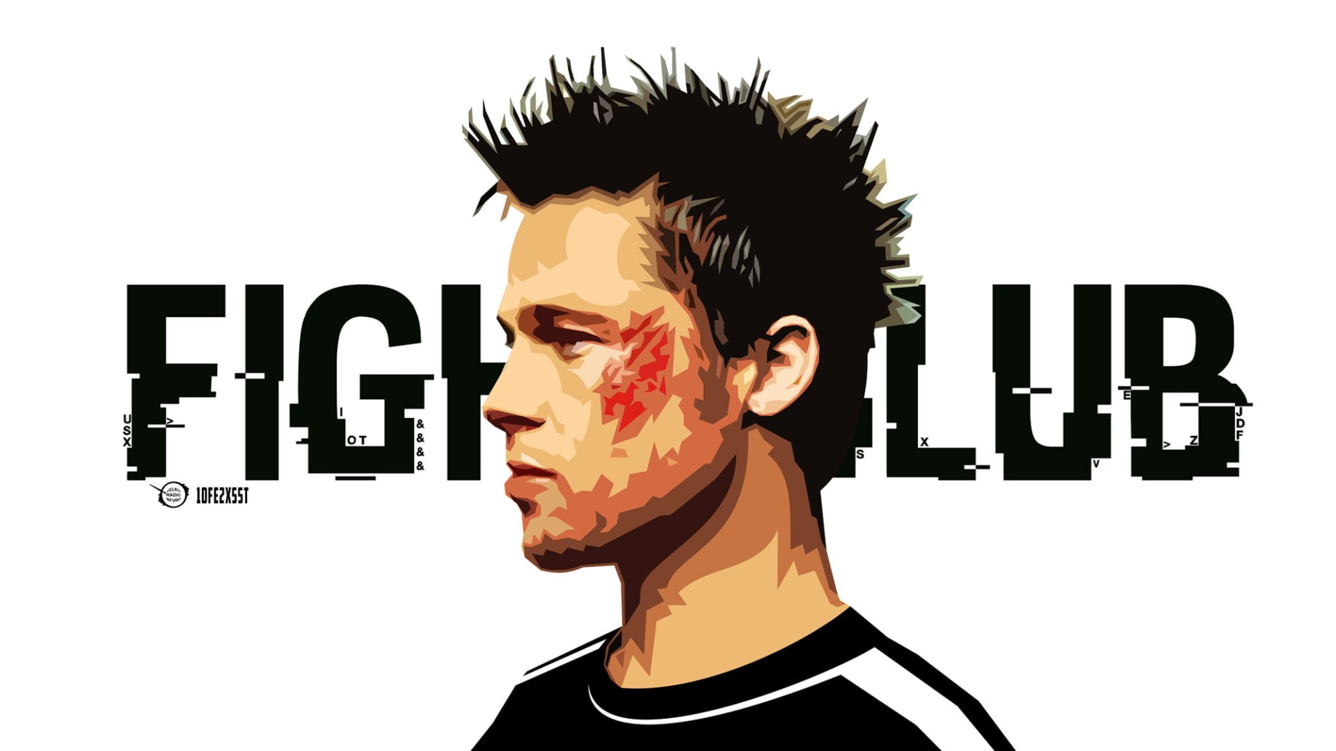
Block Reader
Illustrations by ©AarzooAly

A modern, responsive carousel component with autoplay, navigation controls, and smooth transitions for showcasing images and content.
"use client";

import React, { useEffect, useState } from "react";
import useEmblaCarousel from "embla-carousel-react";
import Autoplay from "embla-carousel-autoplay";
import { AnimatePresence, motion } from "motion/react";
import { ChevronLeft, ChevronRight } from "lucide-react";
import { cn } from "@/lib/utils";

const images = [
  {
    src: "https://res.cloudinary.com/dbvotc5ja/image/upload/v1758312319/image1_suaup3.jpg",
    alt: "Illustrations by ©AarzooAly",
    title: "Block Reader",
  },
  {
    src: "https://res.cloudinary.com/dbvotc5ja/image/upload/v1758312320/image2_a2hqt1.jpg",
    alt: "Illustrations by ©AarzooAly",
    title: "Forest Fungi",
  },
  {
    src: "https://res.cloudinary.com/dbvotc5ja/image/upload/v1758312320/image5_nnt0fx.png",
    alt: "Illustrations by ©AarzooAly",
    title: "Golden Dusk",
  },
  {
    src: "https://res.cloudinary.com/dbvotc5ja/image/upload/v1758312295/image4_w0fxjc.jpg",
    alt: "Illustrations by ©AarzooAly",
    title: "Silent Peaks",
  },
  {
    src: "https://res.cloudinary.com/dbvotc5ja/image/upload/v1758312295/image3_anoblz.jpg",
    alt: "Illustrations by ©AarzooAly",
    title: "Emerald Woods",
  },
];

interface Props {
  images?: { src: string; alt?: string; title?: string }[];
}

const EASE = [0.23, 1, 0.32, 1] as const;

export default function Carousal01({ images: userImages }: Props) {
  const slides = userImages ?? images;

  // Autoplay — calm pace, pauses while hovering so captions are readable.
  const autoplay = Autoplay({
    delay: 3000,
    stopOnInteraction: false,
    stopOnMouseEnter: true,
  });

  const [emblaRef, emblaApi] = useEmblaCarousel(
    { loop: true, align: "center", containScroll: "trimSnaps" },
    [autoplay],
  );

  const [selected, setSelected] = useState<number>(0);
  const [scrollSnaps, setScrollSnaps] = useState<number[]>([]);

  useEffect(() => {
    if (!emblaApi) return;
    setScrollSnaps(emblaApi.scrollSnapList());

    const onSelect = () => setSelected(emblaApi.selectedScrollSnap());
    emblaApi.on("select", onSelect);
    onSelect();

    return () => {
      emblaApi.off("select", onSelect);
    };
  }, [emblaApi]);

  return (
    <motion.div
      initial={{ opacity: 0 }}
      animate={{ opacity: 1 }}
      transition={{ duration: 0.5, ease: EASE }}
      className="relative w-full px-4 py-6"
    >
      {/* Viewport */}
      <div ref={emblaRef} className="overflow-hidden">
        <div className="flex items-center gap-5">
          {slides.map((img, idx) => {
            const isActive = selected === idx;
            return (
              <div
                key={img.src}
                className="min-w-0 flex-[0_0_78%] sm:flex-[0_0_58%] md:flex-[0_0_44%] lg:flex-[0_0_34%] xl:flex-[0_0_28%]"
              >
                <motion.div
                  initial={false}
                  animate={{
                    scale: isActive ? 1 : 0.86,
                    opacity: isActive ? 1 : 0.45,
                  }}
                  transition={{ type: "spring", stiffness: 260, damping: 30 }}
                  className="relative h-[420px] w-full overflow-hidden rounded-2xl bg-muted outline outline-1 -outline-offset-1 outline-white/10"
                >
                  <img
                    src={img.src}
                    alt={img.alt ?? "carousel image"}
                    className="h-full w-full object-cover"
                    draggable={false}
                  />

                  {/* Caption scrim — active slide only */}
                  <AnimatePresence>
                    {isActive && (img.title || img.alt) && (
                      <motion.div
                        initial={{ opacity: 0 }}
                        animate={{ opacity: 1 }}
                        exit={{ opacity: 0 }}
                        transition={{ duration: 0.35, ease: EASE }}
                        className="absolute inset-x-0 bottom-0 bg-gradient-to-t from-black/80 via-black/30 to-transparent p-5 pt-16"
                      >
                        {img.title && (
                          <motion.h3
                            initial={{ opacity: 0, y: 8, filter: "blur(4px)" }}
                            animate={{ opacity: 1, y: 0, filter: "blur(0px)" }}
                            transition={{ duration: 0.35, delay: 0.05, ease: EASE }}
                            className="text-lg font-semibold text-white"
                          >
                            {img.title}
                          </motion.h3>
                        )}
                        {img.alt && (
                          <p className="mt-0.5 text-xs text-white/60">{img.alt}</p>
                        )}
                      </motion.div>
                    )}
                  </AnimatePresence>
                </motion.div>
              </div>
            );
          })}
        </div>
      </div>

      {/* Arrows */}
      <div className="pointer-events-none absolute inset-y-0 left-3 flex items-center">
        <motion.button
          onClick={() => emblaApi?.scrollPrev()}
          aria-label="Previous slide"
          whileTap={{ scale: 0.94 }}
          className="pointer-events-auto rounded-full border border-border/60 bg-background/60 p-2.5 text-foreground backdrop-blur-sm transition-colors duration-150 hover:bg-background/90 focus-visible:outline-none focus-visible:ring-2 focus-visible:ring-ring"
        >
          <ChevronLeft className="size-4" />
        </motion.button>
      </div>

      <div className="pointer-events-none absolute inset-y-0 right-3 flex items-center">
        <motion.button
          onClick={() => emblaApi?.scrollNext()}
          aria-label="Next slide"
          whileTap={{ scale: 0.94 }}
          className="pointer-events-auto rounded-full border border-border/60 bg-background/60 p-2.5 text-foreground backdrop-blur-sm transition-colors duration-150 hover:bg-background/90 focus-visible:outline-none focus-visible:ring-2 focus-visible:ring-ring"
        >
          <ChevronRight className="size-4" />
        </motion.button>
      </div>

      {/* Progress indicator */}
      <div className="mt-6 flex items-center justify-center gap-1.5">
        {scrollSnaps.map((_, idx) => (
          <button
            key={idx}
            onClick={() => emblaApi?.scrollTo(idx)}
            aria-label={`Go to slide ${idx + 1}`}
            className={cn(
              "h-1.5 rounded-full transition-all duration-300 ease-out",
              selected === idx
                ? "w-6 bg-foreground"
                : "w-1.5 bg-muted-foreground/40 hover:bg-muted-foreground/70",
            )}
          />
        ))}
      </div>
    </motion.div>
  );
}
Illustrations by ©AarzooAly